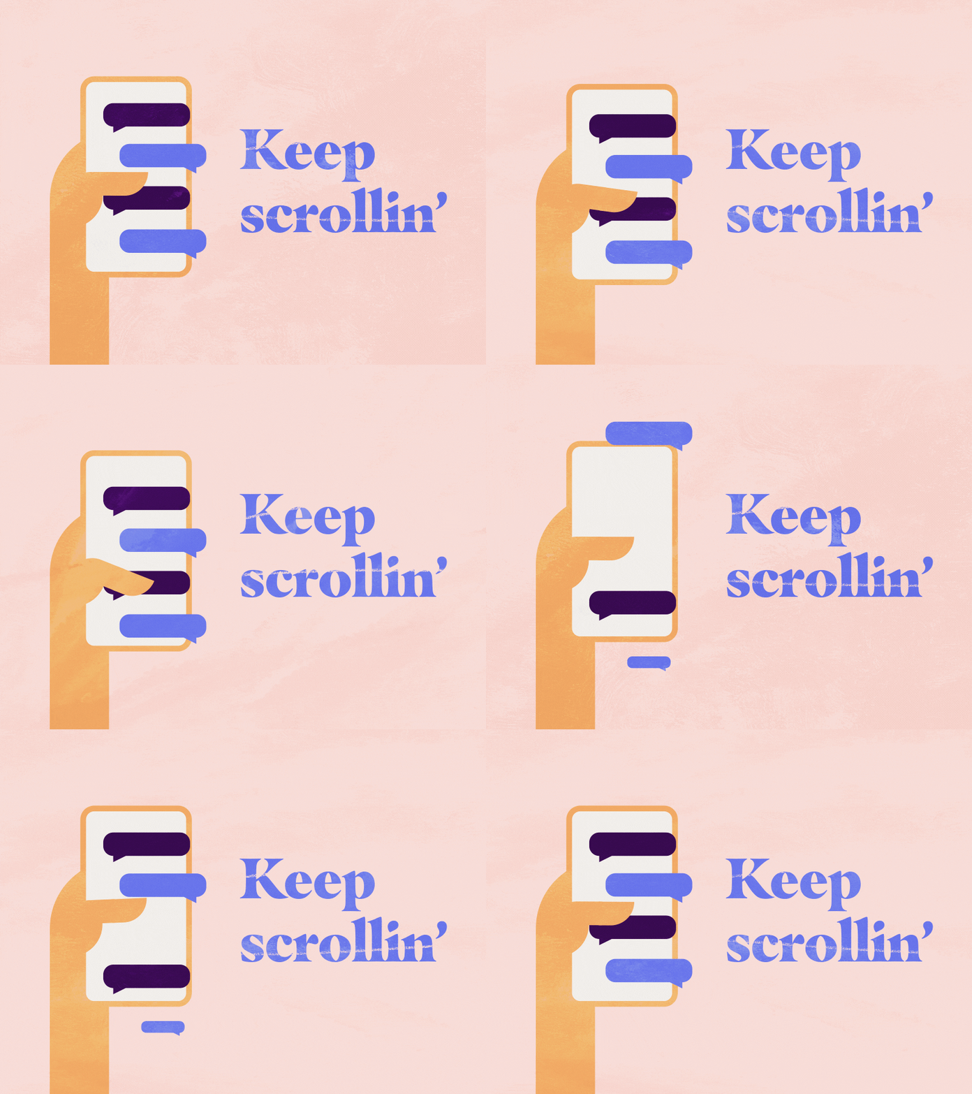
Long-scrolling websites, or those that allow you to scroll down for a longer period of time, have been around for a long time.
What’s the reason? Well, one reason is that they are really popular among users. That isn’t going to change, which is why we wanted to share some advice and best practices with you in this post. Because long-scrolling alone does not guarantee that the user will spend a significant amount of time on your website.
Read on to find out more about the pro’s and con’s.
What Has Changed As a Result of Long-Scrolling Websites?
Websites used to follow the same standards as newspapers; the most essential material was intended to be at the top. There was even a phrase for it: above the fold.
It still applies to Facebook advertising and teasers for blog posts. The teaser impacts whether or not the user will click on the blog article or Facebook ad.
But herein lays the distinction: when a user clicks something, he or she is making a deliberate decision. When scrolling, the user just continues to do what he or she is doing. The deliberate choice would be to stop scrolling.
As a result, the argument for above-the-fold material only partially applies to websites. The major claim and maybe a teaser, may be on the top page, but it may not contain all of the important information.
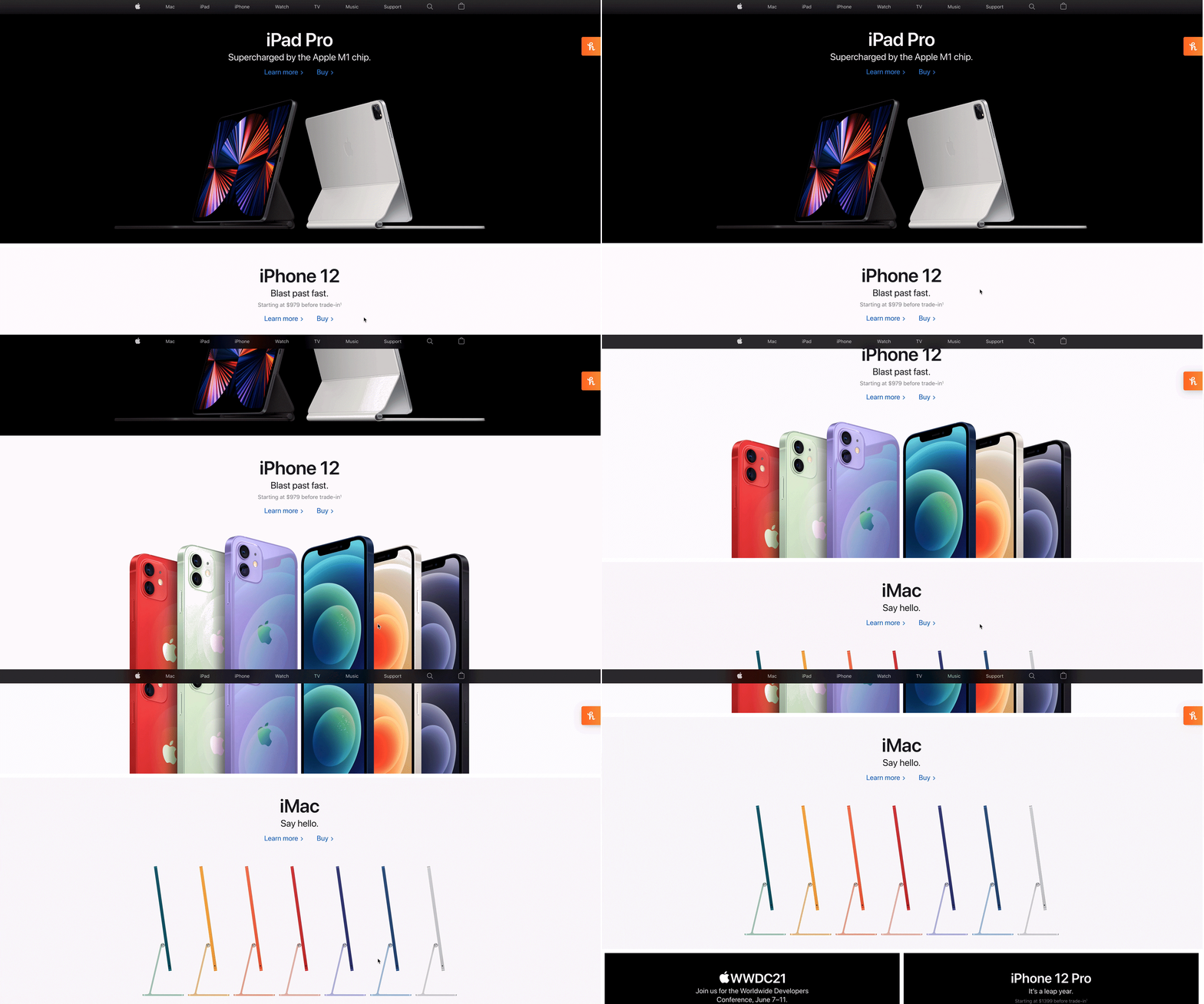
At first glance, you can tell the difference:

Apple website 2021
Contrary to popular belief, infinite scrolling does not increase bounce rates. On the contrary, it keeps the user occupied. At least if done correctly. The longer a person remains on your website, the more probable it is that he or she will respond to your call to action.
When Are Users Going to Stop Scrolling?
Users will continue to scroll as long as the material is appealing to them. The more irrelevant the material gets to the user, the more likely they are to abandon a session.

Another factor contributing to the popularity of long-scrolling web pages is the increasing use of mobile devices. When accessing a website on a tiny screen, scrolling is far more convenient than utilizing buttons.
Storytelling and Long-Scrolling
The challenge for website designers and marketers is to present a story through their website.
There are several design options and effects for this. Animations and parallax scrolling are two examples (more on this shortly).

Another factor that makes long-scrolling appealing is the ability to switch between different forms of material, such as text, images, videos, and gifs.
The Sensation of Control
Long-scrolling offers consumers a sense of control, which is critical for user pleasure.
Users may traverse long-scrolling pages at their own leisure, staying on relevant material or scrolling if it is not engaging to them.
The user may partially control parallax scrolling and animations, giving him or her a sense of control.
Instead of having the user browse around all the time, scrolling keeps him engaged and on subject. There is always a wait when you click a link. If the website takes too long to load, the user is more likely to leave. This is not possible with long-scrolling webpages.
Appropriate Content Structure
One issue with long-scrolling web pages is organizing the material in a logical manner. This is also significant from an SEO standpoint.
In theory, you just need one page, but in most circumstances this is not feasible. It makes more sense to have a horizontal navigation bar with the most significant categories on your website. These are listed on the Brainstorm homepage:
About / Work / Services / Articles
Each of these pages contains distinct sections, however we elected not to utilize lengthy dropdown menus.
Our navigation bar directs visitors to several parts from which they can browse farther throughout the site.
Determining the ideal duration for the user is a significant difficulty with long-scrolling pages.
A user will be overwhelmed if there is too much material.
Too much material may be overwhelming for consumers, resulting in a negative user experience. It is difficult to provide broad advice on this subject because it is heavily dependent on the sort of business or niche the site is in. Products on long-scrolling or infinite-scrolling webpages are more generally accepted on e-commerce platforms.
Interaction and long-scrolling
Long-scrolling was not the first time animations and hovering were used, and the effects are still popular today. The explanation is simple: long-scrolling provides the user with amusement and involvement.
Users are kept busy by interactive components, which also provide a mental rest. Pirate Code’s website is a fantastic example: http://piratecode.ru/en/
Pirate Code (http://piratecode.ru/en/pirate code)
This website displays dynamic waves and allows users to scroll horizontally.
Long-Scrolling & Parallax
The parallax effect has been around for a long time. It was first popular in old video games before being widely adopted by the web design community.
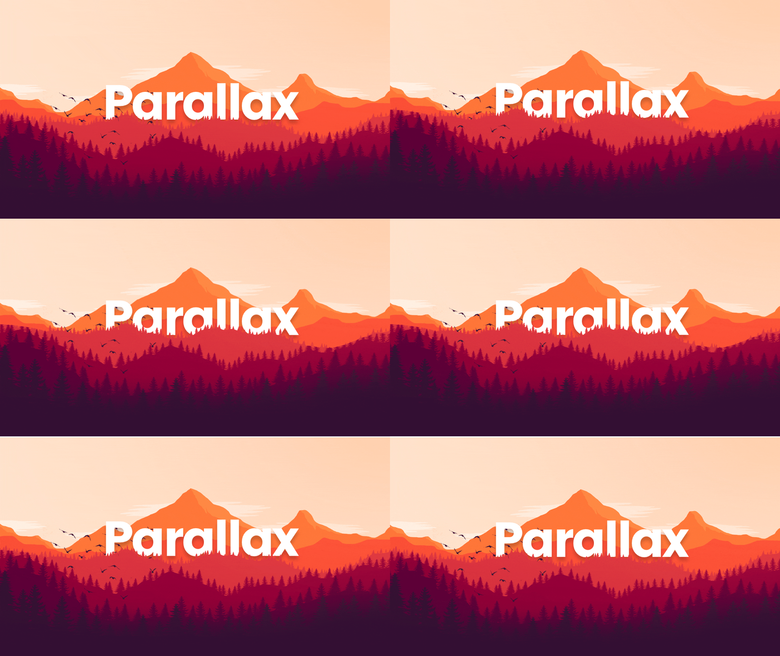
The parallax effect uses multiple backdrops that move at different speeds. As a result, the image appears to be in 3D. The term “parallax” comes from Greek and means “changing.”
The website The Boat is a superb example of a blend of narrative, parallax, and long-scrolling.
It adapts Nam Le’s graphic novel about fleeing Vietnam using current web design technologies.
You may view the movie below, but I recommend going to the site and scrolling through it yourself.
The parallax effect is currently somewhat restricted on mobile devices, however this should change soon due to Ajax advancements. Parallax is an effect that entertains users and is thus growing more popular.
That’s all there is to it.
Long-scrolling webpages have become an essential component of the internet. Users adore them, and businesses may show a variety of material and incentives to their customers.
They are nevertheless difficult because only material that is continually relevant and presented through excellent site design will keep the user scrolling down.
Here’s a rundown of the benefits and drawbacks of long-scrolling websites:
BENEFITS:
- Storytelling that is interactive
- Bounce rates are low.
- Increased immersion
NEGATIVES:
- SEO is a difficult task and needs an expert
- It is challenging to create content and requires a knowledgeable designer.
We’d love to know about your favourite long-scrolling website!
Brainstorm Design – Learn more about Limerick’s Best Web Design Companies.


