©

Date
May 2024
Client
Buffalo Anxiety
Industry
Healthcare
Timeline
2 months

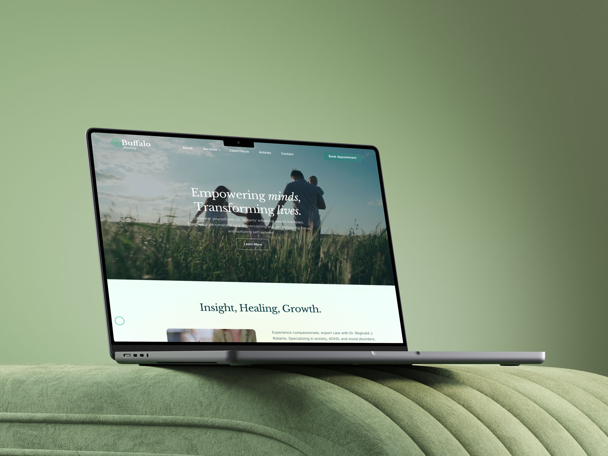
The Challenge
People considering support needed useful information and a manageable intake route at a moment that could already feel demanding.
Healthcare websites carry a high responsibility for clarity. Prospective patients must be able to understand services, assess whether a practice is relevant and reach forms without navigating vague promises or unnecessary complexity. Buffalo Anxiety also serves an audience that predominantly arrives on mobile, so the experience had to remain legible and practical on smaller screens while presenting the practice with care and professional credibility.

The Solution
A reassuring website, responsive forms and focused search activity were aligned around the same patient journey.
Branding, UX strategy, website design, digital forms and Google Ads management were treated as connected parts of the intake experience. Clearer navigation and mobile responsive forms help people reach the right information and complete practical steps, while the visual identity keeps the tone composed. Paid search directs relevant local intent toward focused practice content rather than relying on a generic directory experience.

The Process
The work began with the questions patients ask between an initial search and a completed form.
We mapped the route through service information, confidence checks and form completion, then prioritised responsive structure because 77% of users visited on mobile. Google Ads activity focused on high intent terms such as ADHD testing in Buffalo, with landing paths designed to support understanding and next steps. Throughout, the copy avoided promises about care outcomes and kept the website's role clear.


By the numbers